

client:
project:
services:
10% CABINETRY
BRANDING IDENTITY
Brand Identity
Environmental Graphics
Digital Experience
10% Cabinetry is a cabinetry brand developed for the North American dealer market. The project involved the creation of a complete brand identity system, including brand strategy, logo design, typography, color standards, marketing collateral, environmental graphics, promotional merchandise and digital applications.
The objective was to establish a distinctive and memorable brand that communicates value, simplicity and performance while maintaining consistency across all customer touchpoints.


Using numbers as brand names is both bold and highly memorable. Numbers transcend language barriers and create immediate recognition across different markets and cultures.
The name "10% Cabinetry" was developed around a simple value proposition: delivering greater value, better service and a superior customer experience. The concept reflects the brand's commitment to providing customers with an experience that is consistently "10% better" than competitors.


10% Cabinetry was created to serve the North American mid-market cabinetry industry.
The brand philosophy is built around a simple promise:
PAY 10% LESS.
ENJOY 10% MORE.
This statement reflects the company's commitment to delivering better products, better pricing, better service and a better customer experience. The pursuit of being "10% better" in every aspect of the business serves as both the company's vision and operating principle.


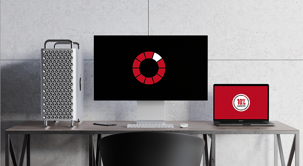
The logo was inspired by the concept of a 10% pie chart. By transforming a simple numerical idea into a recognizable graphic symbol, the logo visually reinforces the brand name while communicating the core concept of value and improvement.
The circular structure represents completeness, consistency and continuous growth, while the highlighted segment visually references the brand's promise of delivering an additional 10% of value.


The basic logo (primary logo) serves as the principal visual identifier of the brand and should be used whenever possible. Consistent application of the logo helps establish brand recognition, credibility and visual consistency across all communications.



The graphic logo serves as a secondary identifier when a simplified brand mark is required. It maintains the visual integrity of the primary logo while providing flexibility across various applications and formats.



The complete wordmark combines the brand name with its core tagline:
PAY 10% LESS. ENJOY 10% MORE.
Together, they reinforce the brand's value proposition and communicate the company's customer-first philosophy.




The visual identity is built around three primary colors: Red, Black and White.
These colors were selected to communicate confidence, energy and reliability while ensuring strong visibility across both digital and physical applications.


A supporting color palette was developed to provide flexibility across marketing materials, environmental graphics and digital applications while maintaining overall visual consistency.


Typography plays a critical role in the visual identity system. The selected typefaces were chosen for their clarity, versatility and modern character, ensuring consistency across print, digital and environmental applications.


Professional identity system designed to ensure consistent brand representation across client-facing communications.


A unified stationery system developed to reinforce brand recognition across internal and external communications.


Branded apparel designed to strengthen team identity and create a consistent customer experience.


Quality assurance labels designed to support manufacturing processes and reinforce brand standards.


A collection of branded merchandise developed to extend brand visibility and customer engagement.


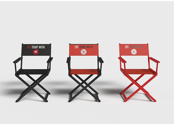
Physical brand applications developed to ensure consistency across showrooms, facilities and customer touchpoints.


Retail display systems designed to communicate product features and strengthen brand storytelling.